Tuesday, October 13, 2015

RASTER RGB and INDEXED Increased Resolution Quality Comparison


-INDEXED-

-With the INDEXED color mode the image looks very JAGGED and choppy at the edges of the image

-This happens because INDEXED color mode only has a certain number of colors making it difficult for the computer to blend the colors together creating the JAGGED edges we see here.


-RGB-

-With RGB color mode the image looks way smoother in the edges and overall is a better image compared to its UGLY TWIN(Indexed)

-The smoothness of the image is thanks to the RGB color mode, with its 16.7 million combinations of color, the edges of the image can smoothly transcend from one color to the other with out showing the pixel.









VECTOR File Size Comparison


- SIMPLE


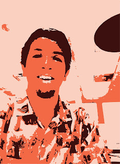
 -This image is Vectorized and is using image trace using 3 colors, so its a SIMPLE file using minimal colors.
-All the anchor points in the image surround the fill ins of the picture, for example the big yellow, black and white fill ins.

-FILE SIZE= 2.4 MB


 - COMPLEX

-This Vectorized image is using image trace on HIGH FIDELITY PHOTO,which traces as much information as possible making the image COMPLEX.
- The amount of anchor points in this image literally covered the whole image, turning it blue with dots, since HIGH FIDELITY trace captures all the little lines and shadows.
- Compared to the SIMPLE image the COMPLEX one has countless more details, there fore it will contain way more anchor points.

-FILE SIZE= 5.2 MB


-LINE

-This is an image of a line, made in ADOBE ILLUSTRATOR its a VECTOR image

-Being a simple LINE it is the base of all VECTOR images, creating it does not take many anchor points. Since it is a LINE you can actually count the number of anchor points which are 2, the other TWO images in the other hand would take a while to count every anchor point.

-FINAL SIZE= 1.6 MB


Monday, October 12, 2015

VECTOR Self-PORTRAIT


- In this assignment our goal was to transform our selfie from a RASTER image to a VECTOR image using ADOBE ILLUSTRATOR.

-RASTER- is an image that contains pixels.

-VECTOR-is an image that uses mathematical equations to create lines does not contain pixels.

- the process to transform these images was nice and simple

1) First, I created a LETTER document in PORTRAIT orientation, once that is done then drag or FILE-PLACE the image.

2) After opening your image in ILLUSTRATOR, press the SHIFT key then click the mouse to resize image proportionately (make sure to let go of mouse button first THEN shift key) try to fit image in white space.

3) Once completed with those steps, make sure to save your progress for it will be painful if any is accidentally erased.

4) Select image with the SELECTION TOOL, then select IMAGE TRACE in the drop down menu, this will give you different types of tracing of your image, pick the best one for your image.

5) After your done with that use the DIRECT SELECT tool and click on different areas of the image, this is when it is clear that the image is no longer a RASTER image but a VECTOR image made up of shapes and fills.


INDEXED COLORS and Quality


-when trying to make a File size a little smaller or reduce the total amount of colors in a photo INDEXED color mode is the way to go. Since you can choose how many colors to include in your image.
-with INDEXED color mode you can specifically choose how many colors you want to show up in your image
-for example in this image here I only have 6 colors, the result of that is a simplified version of the picture I originally took.
-since there are less colors in the picture that means that my file size will be smaller since there is less DATA in the image

more COLORS = more DATA = BIGGER file size


- If you want your image more detailed you can add more colors in the mix as well making certain parts of the image more clear.
-Obviously the more colors you add to the image the bigger the file size will be
- This color mode comes in handy when dealing with images with simple color palates, so you can manually remove or add as many colors as you can to reserve space or to blast the image with color.


JPEG COMPRESSION and FILE SIZE


-When saving in a JPEG, you want to boost your quality all the way up, or your image will suffer by not looking its best.
-This image was saved in JPEG quality of 0
-File Size does not change


- This is the same JPEG image but done in quality of 60, this makes a very good difference compared to the quality 0 picture above. But still not the best you can do.


-At quality of 100, the best possible quality is achieved through a JPEG and your image will not have the ugly choppiness that quality 0 had.


PEN TOOL


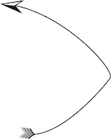
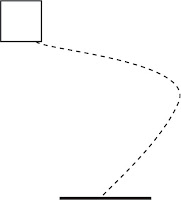
-to get a CURVED arrow at the Start of a curved line you must get the pen tool create a line click and hold the middle to create the curve then using the tool bar above click on "window" then stroke.
- once you have clicked on stroke place the arrow in the beginning of the line by choosing the box on the left side for the type of arrow to choose


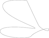
-to get an ORGANIC shape with the pen tool start by clicking the mouse and holding the mouse button, once you make your line as long as it needs to be, that is when you let go of the button and the line will curve any way you want until you click one more time


-when making this kind of line, You must go and choose your pen tool and create a normal curved line. once you are done with that you go to WINDOW and click on STROKE, it will show you a box with many options on what to do with your line. by clicking spaces, you can choose to turn your line into a dotted line.
- you can control every thing from the thickness of the line to how far apart you want the spaces to be.


SHAPES


SEMIOTICS LOGO


SEMIOTICS LOGO
-Discuss-
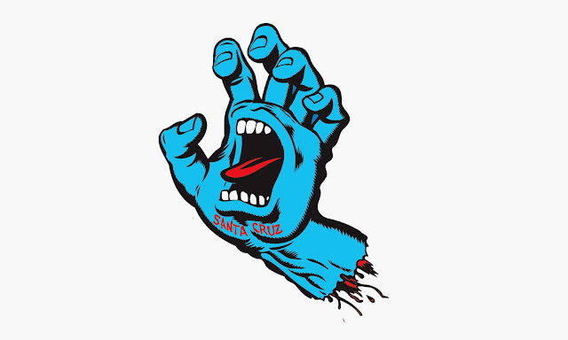
The logo I have chosen represents the skateboarding company Santa Cruz. It is a blue severed hand with a mouth in the palm.

-Specific Symbols- 
 The Hand, screaming mouth, blood

-ORIGIN of Symbols-
 *For blood, the meaning is closely tied with passion, but also with death, war, sacrifice and the warding off of malicious powers
*For the screaming mouth, it could symbolize anger, anxiety, and intensity.
*For the Hand, the origin of what a hand symbolizes all depends on how the hand is positioned and if it is left/right. A left hand symbolizes decay/death, but as far as the hand position goes it all depends on the viewer. Its current position looks to me as if its a bit intimidating, most certainly  threatening, you don't want to shake that hand.

  
-Discuss Meaning-
 All these symbols seem fitting for a hardcore skateboard company like SANTA CRUZ. The blood for example professional skateboarders really have a PASSION for skateboarding scraping their skin off constantly and getting their foot coordination right. Its a war between you and whatever obstacle your trying to conquer, hence the bloody strips of flesh hanging off the arm and the bright red tongue. Representing all the blood the skaters must spill to support and skate for their team (Santa Cruz).

 The screaming mouth symbol could mean how angry one of the Santa Cruz team-members get when not being able to land a trick for their video. (screaming as a result) Or the screaming mouth can also represent how intense their skateboarding is, since each skateboard maneuver has some painful consequences if its a failure.

 Last but not least is the HAND symbol, not sure if the artist was meaning to use the left hand which signifies death, but it could mean that the team will slay any competitor who challenges them and bring death to the toughest skate spots. Judging on the position of the hand, it symbolizes a firm intimidating position symbolically saying they are no pushovers, these guys will push back. 

-Semiotic CATEGORY-
This type of logo would be probably be categorized as a SYMBOLIC image, since you would have to know this bloody hand is representing a group of professional skateboarders.


Sunday, October 11, 2015

COLOR MODE Exercse

COLOR MODE: RGB
-Number of Colors: 60.7 Million
-Uncompressed File SIZE: 4.89 M


COLOR MODE: Gray Scale
-Number of Colors: 256
-Uncompressed File SIZE: 1.63 M 


COLOR MODE:Indexed Color
-Number of Colors: 256 or less
-Uncompressed File SIZE: 1.63 M


 COLOR MODE: BITMAP
-number of Colors: 2
-Uncompressed File SIZE: 208.5 M 


 -Can you change FILE FORMAT just by changing it's name?
   no you can not,


-How many colors are in the following COLOR MODES

-RGB= 16.7 million colors


-INDEXED COLOR= less than 256


-GREYSCALE= 256


-BITMAP= 2


VECTOR and RASTER logos


Here is how to transform a RASTER image into a VECTORIZED image using Adobe Illustrator.

With Adobe Illustrator you open up the image 
  you want to edit. The image might be a little over sized, using the mouse and the shift key to evenly  shrink it down to size. At the top of the screen there is a button that says image trace, from the  options it shows you, you must pick the image trace and choose which option makes the image more  identical to the original. 


After the colors of the image are as identical as possible to the original, that is when you are finished with turning the image into a raster image. Click "SAVE AS" and save it in ".AI" format. After saving it in an .AI format if you plan on sending this image or posting it online go to FILE and click on SAVE FOR WEB, by doing this you can now change the format to either " .JPEG " or " .GIF ". Now the file is ready for delivery to be posted in blogs like mine or to be sent to a friend to show them your ADOBE ILLUSTRATOR skills.


Tuesday, September 1, 2015

SEMIOTICS

SEMIOTICS!!!

-Semiotics is the science of SIGNS- 

There are three categories of semiotics

-ICONIC-            -INDEXICLE-         -SYMBOLIC-
the symbol looks            the symbol shows               A symbol that has to
 like what its                  the cause and effect          be learned what it means.     
 represents.                   of what it represents.


Crayon Rubbing Symbol

-The symbol I used here is the Arizona Western College symbol

-This type of symbol would be a symbolic one since you have to learn that it represents the college.
-The meaning of this symbol is the college that is located in the foothills, that is why it looks like two mountains that are actually an A and a W. Or the A could represent a stylized tear drop for all the college students that get Fs. 
  

Tuesday, August 25, 2015

CRAYON_ReubenAltamirano


GOALS of Assignment 
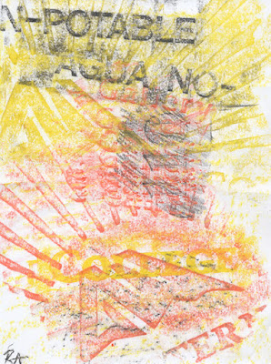
  -The goal of this assignment is to point out the difference between texture, symbols, and text and use  crayon rubbing to overlap these elements. 

New Skills that I Learned 
-I learned that you can create cool looking designs with ease by just using a crayon and a relief surface and the difference between Texture, Symbols, and Text. 

 
Critique on Crayon Rubbing 1
 -While creating the first crayon rubbing, I tried to use a nice warm color scheme since the sun was radiating a great amount of heat and since the AWC logo has sun like rays coming out of it. Then using the black to make the text of AGUA-NO stand out.
There was also the gallery room nearby so using the relief of the word GALLERY, I placed it multiple times in the center of the page not really completed all the way since I rushed to fill in the space.


Critique on Crayon Rubbing 2
-On this second crayon rubbing, there was a total opposite color scheme of the first one just to mix things up except for the orange background. Using Purple, Blue, gray, and a subtle warm orange, being close to the rest rooms I rubbed over the words in both gray and purple one being upside down for a more dynamic point of view, as for the orange background there was a perfectly placed palm tree trunk for my use and laid my paper on there. To complete the over-lapping of symbols and texture I finally added multiple 1s and 5s through the top half of the paper completing the second crayon rubbing and also the assignment. 


Monday, August 24, 2015


  Introduce Yourself:

 My Name is Reuben Altamirano, I am 21 years old and am attending Arizona Western College here in Yuma Arizona. I love all types of art, skateboarding, and making art myself

 What is your Major:

 My major is in Graphic Design, my goals in taking this graphics class is to have basic understanding of computer software systems like Photoshop and just learn more about computer graphics in general, so I could be more prepared with how to use modern technology.

What University are you going to continue education

After I am finished with my education in Arizona Western College, I plan to continue my education at A.S.U.

What kind of Experience with Graphics/Design

I do have past experience in painting and drawing, but none on Graphics.

 Vacation Spot

                                                                                              the perfect vacation spot to be in would be
                                                                                                any of the islands of Hawaii because of
                                                                                                their consistent warm weather.