GOALS of Assignment
-The goal of this assignment is to point out the difference between texture, symbols, and text and use crayon rubbing to overlap these elements.
New Skills that I Learned
-I learned that you can create cool looking designs with ease by just using a crayon and a relief surface and the difference between Texture, Symbols, and Text.

Critique on Crayon Rubbing 1
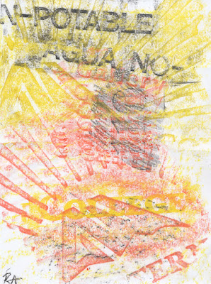
-While creating the first crayon rubbing, I tried to use a nice warm color scheme since the sun was radiating a great amount of heat and since the AWC logo has sun like rays coming out of it. Then using the black to make the text of AGUA-NO stand out.
There was also the gallery room nearby so using the relief of the word GALLERY, I placed it multiple times in the center of the page not really completed all the way since I rushed to fill in the space.

Critique on Crayon Rubbing 2
-On this second crayon rubbing, there was a total opposite color scheme of the first one just to mix things up except for the orange background. Using Purple, Blue, gray, and a subtle warm orange, being close to the rest rooms I rubbed over the words in both gray and purple one being upside down for a more dynamic point of view, as for the orange background there was a perfectly placed palm tree trunk for my use and laid my paper on there. To complete the over-lapping of symbols and texture I finally added multiple 1s and 5s through the top half of the paper completing the second crayon rubbing and also the assignment.
